

Table of contents


No headings in the article.
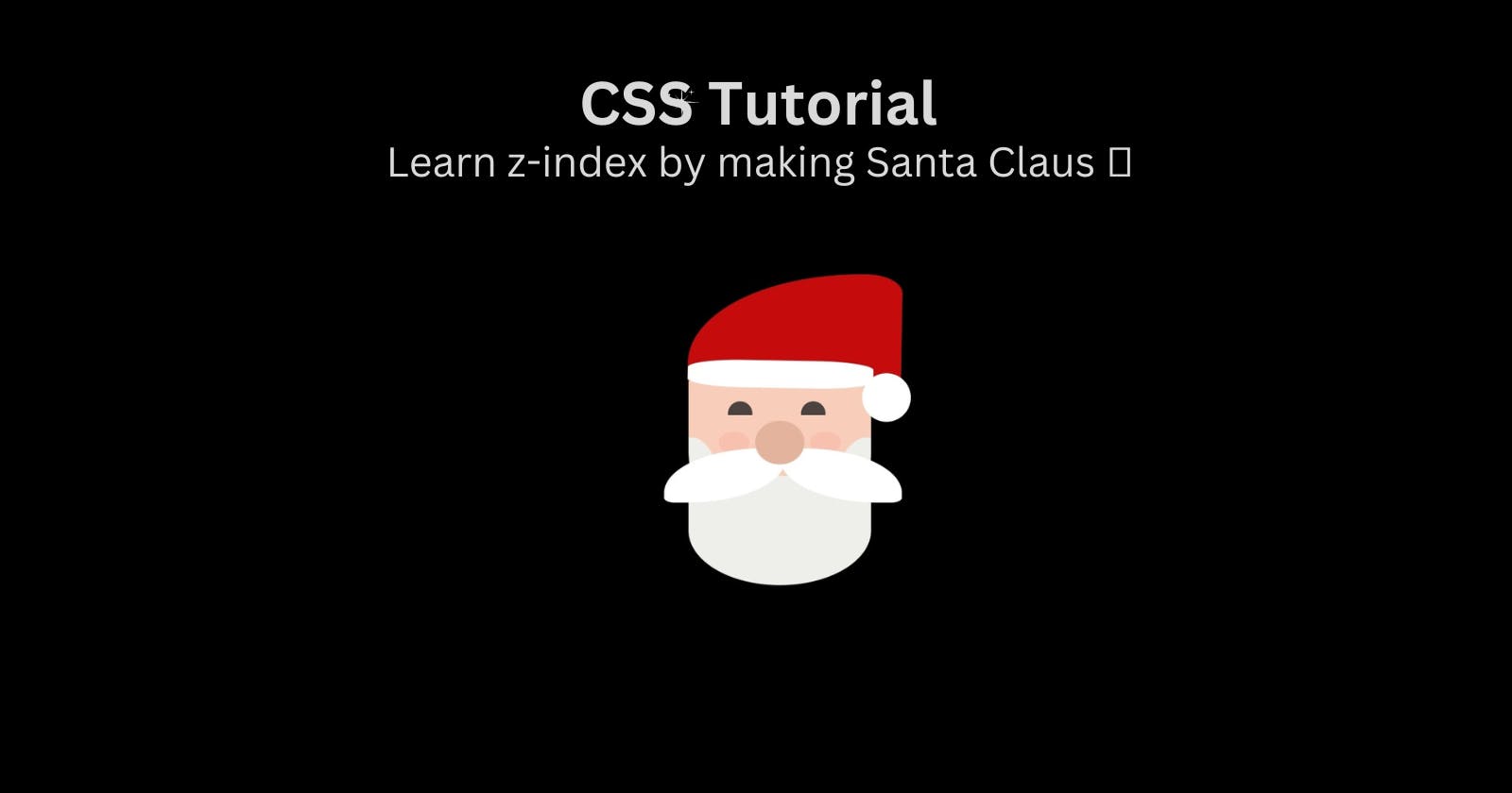
In this article, we will cover what is z-index, how it is applied and the process to select the right z-index.
We will implement our learning by using z-index to make Santa Claus face. In the end, we will add some animation to Santa.
I hope this article can give you clarity on how to assign a z-index value or why it doesn't work in some cases.
What is z-index?
z-index is a CSS property which controls the stack order of HTML elements. Elements with a higher z-index value appear on top of the elements with lower values.
Now, what is stack here?
With the z-index, we are positioning elements on Z-axis.
You can imagine a hypothetical line starting from your eye to the screen, that is Z-axis.
If we change the element position based on X-axis, the element will move in a horizontal direction. If we change the element’s position on the Y-axis, then the element will move in a vertical direction.
In the case of Z-axis, the elements are placed on top of each other. That means, there will be overlapping of elements.
This CSS property is not straightforward
Condition for z-index:
z-index has a very important condition, without which it won't work. This property is the position of an element
z-index will only work on an element whose position property is set to absolute, fixed, relative or sticky.
Let's understand how the z-index works in 4 different cases:
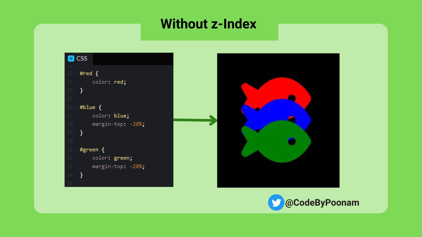
Without z-index
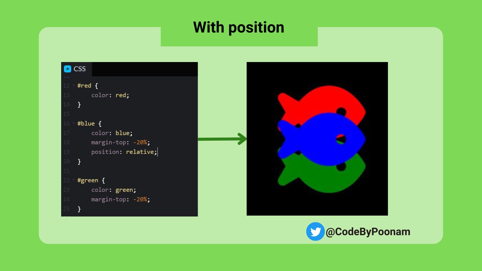
With position, Without z-index
With z-index, without position
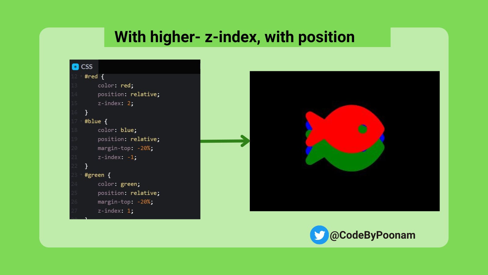
With z-index & position applied
Without z-index: In this case, the stacking order is the same as per HTML order. The last defined element will be on top. Hence green fish is in the front.
With position, Without z-index:
When position elements with value i.e. relative, absolute, fixed or sticky applied. This will change the stack order. In the below example, blue fish is applied position relative, hence we see it in front.
With z-index, without position applied
If you will use z-index without position, it will not do anything. Position element is required for z-index.

With z-index and position applied
Element with a higher z-index will be in front. If the element has a negative z-index, it will be in the back. In the below example, red fish has a higher z-index. Note: z-index values are not global and stacking will be limited for child elements.
Let us understand this by example. We will create Santa Claus using z-index.
HTML Structure:
We will first create a parent element called a class container. Inside the container, we will add all the details of Santa Claus’s face with separate div’s.
Check out all the div’s in HTML :
<div class="container">
  <div class="face"></div>
  <div class="beard"></div>
  <div class="eyeLeft"></div>
  <div class="eyeRight"></div>
  <div class="moustacheLeft"></div>
  <div class="moustacheRight"></div>
  <div class="nose"></div>
  <div class="blushLeft"></div>
  <div class="blushRight"></div>
  <div class="cap"></div>
  <div class="capTail"></div>
</div>
CSS Styling:
Start styling with basic layout settings.
Body tag:
Let’s start by adding the background in CSS. To do so, we will use a body tag.
/* Custom properties values */
:root {
  --background: #34495e;
}

body {
  background: var(--background);
  display: flex;
  justify-content: center;
  align-items: center;
  height: 100vh;
  width: 100vw;
  overflow: hidden;
}
Assign background
Insert the background color of your choice. In this demo, I have defined it with a variable named --background inside the :root selector. Variables in CSS are declared using the var() function. The variables inside :root selector creates global scope, and thus can be used to store values that will be reused throughout the stylesheet.
Position items in center
We will use display property flex. This will make the container as flexible.
In order to get all the items in the center, we will use justify-content and align-items property.
justify-content will align the flex items to the center of the container along the main-axis (horizontal direction). align-items will align the flex items to the center of the container along the cross-axis (vertical direction).
- Set dimensions of the body tag
We will utilise the entire screen size, so will use 100vh and 100vw.
Calculation: 100vh = 100% of the viewport height
100vw = 100% of the viewport width
- Hide scrollbars with overflow: hidden property.
Container Class:
Assign relative position to the container and all the other div will be in absolute position inside the container. Define the height and width of the container.
We will use box-sizing as a border-box. This will include padding and a border of an element within.
.container {
  position: relative;
  width: 100vmin;
  height: 90vmin;
  box-sizing: border-box;
}
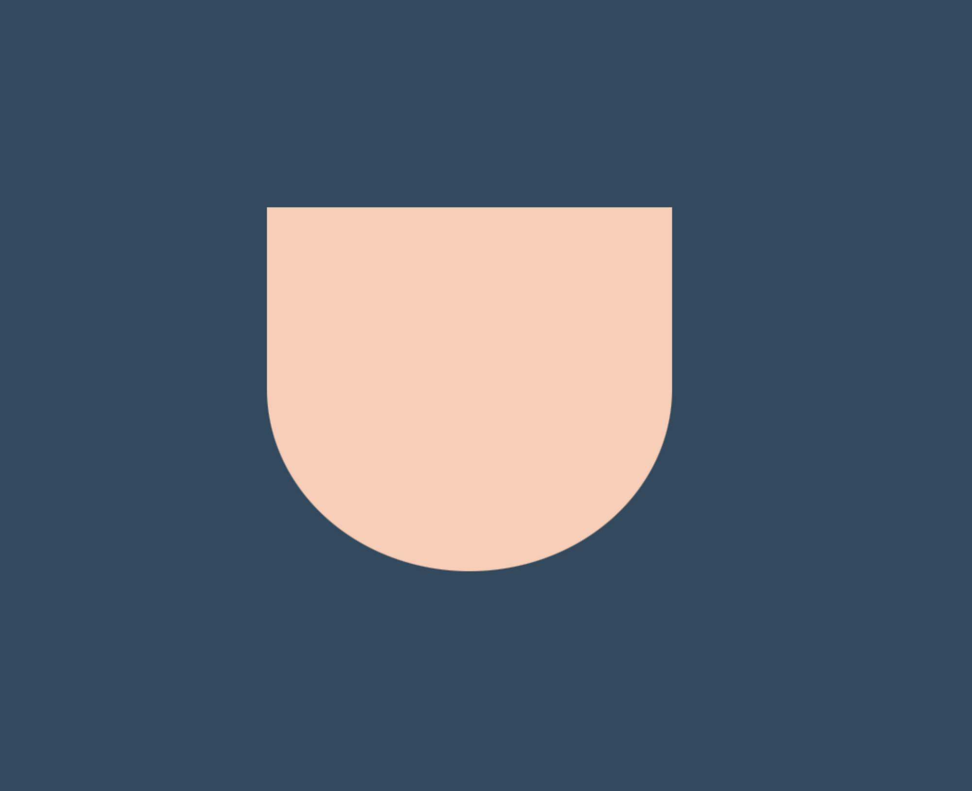
Santa’s face:
We will make U-shaped face.
:root {
  --skin: #f8ceba;
}

.face{
  /* Position absolute in relation to container class */
  position: absolute;

  /* U-shape face of Santa */
  width: 30%;
  height: 30%;
  border-radius: 0 0 90% 90%;
  background: var(--skin);

  /* Move face to the place where you want on the screen */
  top: 15%;
  left: 35%;

  /* Lowest z-index as all the other parts of face will be on top */
  z-index: 1;
}
The face will be positioned absolute in relationship with the container class, so use position: absolute property.
I have defined all the heights and widths in percentage for face elements to make our Santa responsive. In order to make Santa’s face in a U-shape, we will add border-radius to the bottom of a face only.
We will assign the lowest z-index to a face, as all other parts of face i.e. eyes, nose etc. will be on top of the face.
Here is an image of the result:
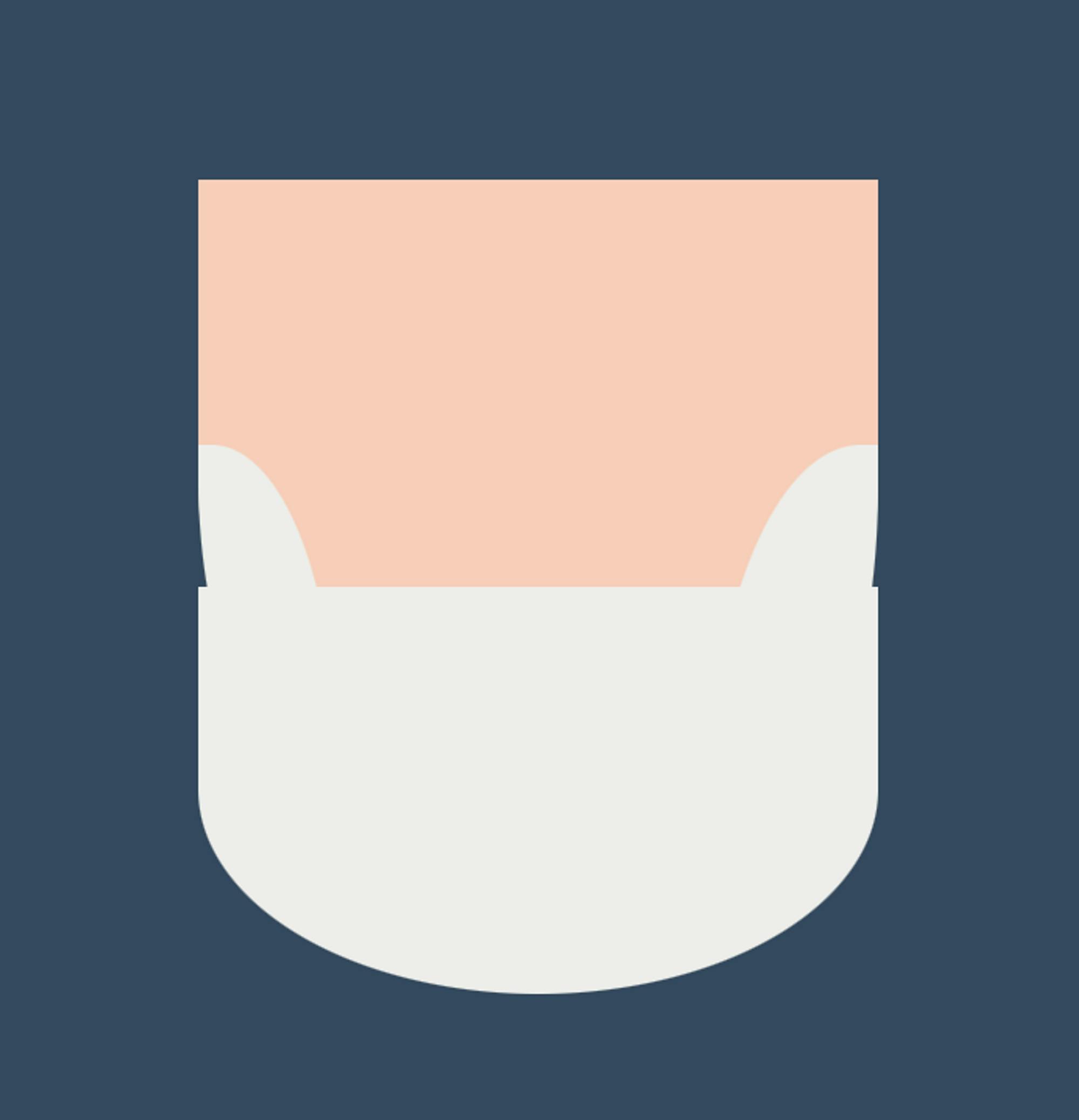
Beard:
:root {
  --beard: #eeeeeb;
}

.beard {
  /* Position absolute in relation to container class */
  position: absolute;

  /* U-shape beard of Santa */
  width: 30%;
  height: 20%;
  border-radius: 0 0 90% 90%;
  background: var(--beard);

    /* Adjust beard to the place it on Santa's face */
  left: 35%;
  top: 35%;

    /* z-index will be more than face */
  z-index: 2;
}
Just like face class, we will assign the beard’s position as absolute.
I have assigned the beard’s width equal to the face’s width i.e. 30%. To make Santa’s beard in U-shape, use border-radius property.
Move the beard to a right location on Santa's face
Assign the z-index as 2, because the beard will be at the top of face. (Face z-index: 1)
Result:

Also, we will use ::after and ::before pseudo-elements with beard class, to add beard to the left and right side of Santa.
/* Beard Left Side */
.beard::after {
  content: "";
  display: block;
  position: absolute;
  width: 20%;
  height: 80%;
  background: var(--beard);
  top: -35%;
  border-radius: 0 90%;
}

/* Beard Right Side */
.beard::before{
  content: "";
  display: block;
  position: absolute;
  width: 25%;
  height: 100%;
  background: var(--beard);
  right: 0%;
  top: -35%;
  border-radius: 90% 0;
}
Pseudo-elements ::after and ::before allows us to insert “content” before and after any non-replaced element. An additional property called content is also used. It can only be used with the pseudo elements ::after and ::before.
We will assign content: “ “ to set the content of the pseudo-element to an empty string, which means it will not display any content.
The position: absolute here will set the position of the pseudo-element to be absolute, which means it will be positioned relative to the nearest positioned ancestor element. In this case, it will be positioned relative to the beard class.
Border-radius plays an important role here. We will assign opposite border-radius dimensions for the beard left and beard right.
Here is how our Santa look till now:
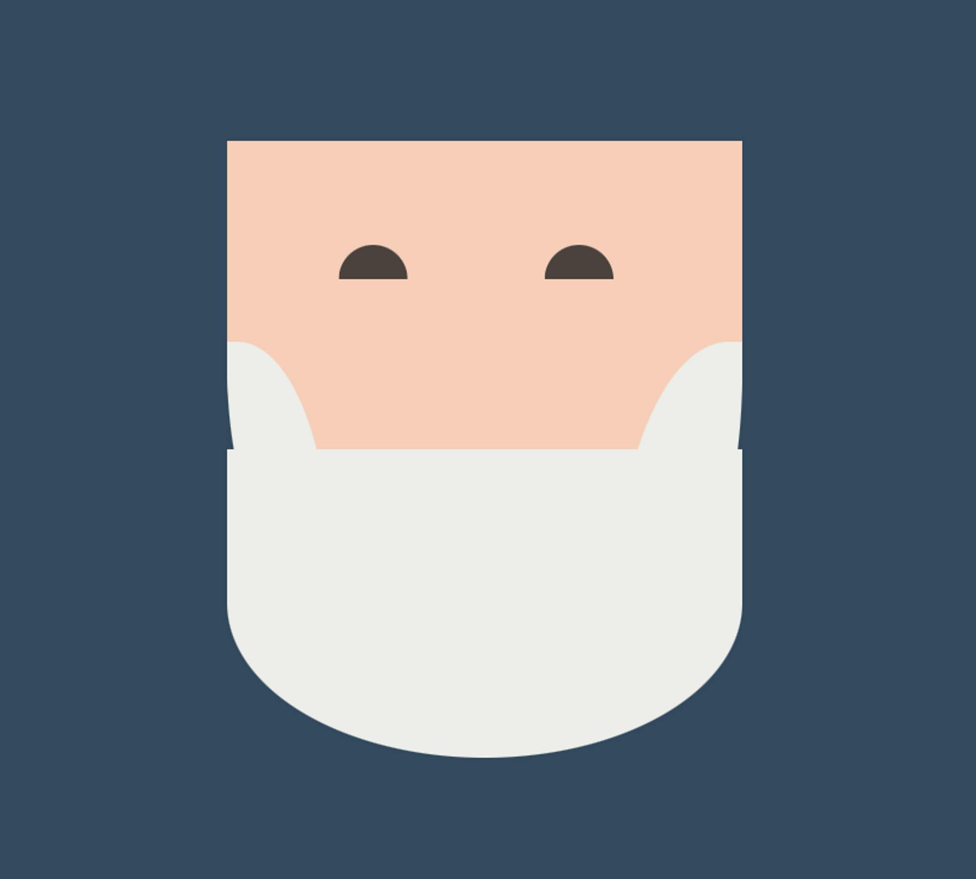
Eyes:
Since both left and right eye will have common properties, We will start with 2 classes .eyeLeft and .eyeRight.
:root {
  --eyes: #4c423f;
}

/* Common properties of both eyes */
.eyeLeft, .eyeRight {
  position: absolute;
  width: 5%;
  height: 3%;
  background: var(--eyes);

    /* Cut semi-circle from rectangle */
  clip-path: circle(50% at 50% 100%);
  top: 21%;
  left: 41%;
  z-index: 2;
}

.eyeRight {
  left: 53%;
}
I purposely gave more width than height, as I didn’t want round eyes.
We will use the clip-path property to create a semi-circle shape out of a rectangle.
After assigning common properties, we will move eyeRight using the left property.
We will use z-index: 2 for both eyes, as eyes will be placed on the top of the face.
Look what we have made:
Moustache:
We will first assign common properties of moustacheLeft and moustacheRight.
/* Common properties of both sides of mustache */
.moustacheLeft, .moustacheRight {
  /* Position absolute in relation to container class */
  position: absolute;
  /* Set dimensions of mustache */
  width: 20%;
  height: 10%;
  background: white;
  border-radius: 90% 20% 90% 10%;
  /* Adjust moustache to the place it on Santa's face */
  top: 30%;
  left: 31%;
  /* z-index will be more than beard */
  z-index: 3;
}

.moustacheRight {
  /* Adjust moustacheRight to right side of face and give dimensions */
  left: 50%;
  border-radius: 20% 90% 10% 90%;
}
Different border-radius values are given to make it replica of Santa’s moustache.
z-index is assigned 3 as the moustache will be on the top of beard.
Once common properties are assigned, we will move moustacheRight using the left property.
We will give border-radius dimensions of the right moustache as a complete replica of a left moustache.
Outcome:

Blush:
Just like eyes, we will have common properties of 2 classes .blushLeft and .blushRight.
/* Custom properties values */
:root {
  --blush: #f001;
}

.blushLeft, .blushRight {
  /* Position absolute in relation to container class */
  position: absolute;
  /* Make oval shape */
  width: 5%;
  height: 4%;
  background: var(--blush);
  border-radius: 50%;
  /* z-index will be more than face but less than moustache */
  z-index: 2;
  /* Adjust left blush on Santa's face */
  top: 27%;
  left: 40%;
}

.blushRight {
  left: 55%;
}
Blush will be oval in shape, therefore, we will use different width and height values.
Since blush will be on the top of face, but under the moustache, so z-index will be 2. (face z index: 1 and moustache: 3)
Place blush left on Santa’s face using top and left properties.
Here is our Santa until now:

Cap:
Santa’s cap will be created in three parts.
.cap class will be the top red portion.
We will first make a rectangle and then give it border-radius to make Santa’s cap shape.
.cap::before will be used to create the bottom white portion of cap.
We will create a rectangle for this and then assign it border-radius of 30%.
.cap::after will be used to create a white ball of Santa’s cap.
Create a white circle to make this.
/* Red part of Santa's cap */
.cap {
  position: absolute;
  width: 35%;
  height: 20%;
  background: var(--cap);
  border-radius: 100% 20% 0 0;
  top: -2%;
  left: 35%;
  rotate: 1deg;
  z-index: 3;
}

/* White rectangle part of Santa's cap */
.cap::before {
  content: "";
  display: block;
  position: absolute;
  box-sizing: border-box;
  position: absolute;
  width: 87%;
  height: 25%;
  border-radius: 30%;
  top: 80%;
  background: white;
}

/* White ball of Santa's cap */
.cap::after {
  content: "";
  display: block;
  position: absolute;
  width: 8vmin;
  height: 8vmin;
  border-radius: 50%;
  background: #fff;
  right: -5%;
  top: 90%;
}
Yes, our Santa’s face is done. Look how cool he looks:

Animation:
In the .eyeLeft and .eyeRight classes, we'll add the animation of making Santa’s eyes wide and narrow.
The name of the animation is close, It will be linear so that it play at the same speed from beginning to end with a duration of 1s and for infinite iterations.
@keyframes will be used to add these animation details. I have made Santa’s eyes wide and narrow by changing clip-path values in the keyframes.
.eyeLeft, .eyeRight {
  .
  .
  .
  animation: close 1s linear infinite;
}

@keyframes close {
  from {
clip-path: circle(50% at 50% 100%);
  }
  to {
clip-path: circle(50% at 50% 80%);
  }
}
That’s it, our Santa is ready with moving eyes. 👀
Find the code on CodePen.
👋 Hello, I'm Poonam, I share blogs, project ideas and tips on CSS, TailwindCSS and JavaScript.
Thanks for reading this article. Hope you enjoyed making Santa with me.
Thank you for reading! If you liked this article please consider sharing it.